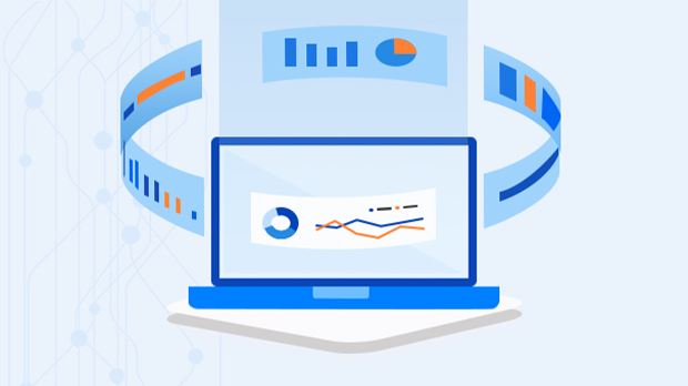
Data visualization is an important technique that gives an idea about trends, patterns, and outliers within large data sets. Visual representation of the data makes it easy to interpret data quickly.
These days we are always overwhelmed by data getting to us at such great velocity and mass that we are generally taken aback even before realizing its reach. The variety of forms and structures it comes to is a challenge to maintain a sensible single infrastructure to handle it. The next challenge is using it to its full potential and making real sense out of data analytics easily. Not everyone is well prepared to read the large volume of rows and columns and has the skill to interpret anomalies and outliers easily. Most data is a series of known facts arranged in these manners.
In recent years making this data useful was a challenge and then came the art of making it look beautiful. Data Visualization is one such art form that enables the data to be represented in different graphical or pictorial forms. The main objectives of data visualizations are to help comprehend the complex datasets arranged in a visually appealing manner and are easy to interpret for human brains.
Data Visualizations are generally used for multiple purposes, but the main categories are:
Data Visualization for Comparing Values
- Comparison of 2 or more values
- Column or Bar Charts
- Comparison across time
- Column Chart
- Line Chart
- Circular Area Chart
Displaying Distribution
- Histograms
- Area Charts
- Scatter Plots
Displaying Relationships
- Scatter Plots
- Bubble Plots
Analyzing Compositions
- Stacked Column
- Stacked Area
- Waterfall
- Pie Charts
Techniques for creating various data visualizations and the basis of choosing is mainly dependent on the below factors:
Line Chart
- For a continuous data set either by timespan or any other element.
- Mostly to plot and understand trends, patterns.
- Comparing different datasets. Visualize progress.
Example: comparing four products across a timespan but no in-depth analysis.

Column or Bar Chart
- Simple comparison between 2 or more values.
- Categorized information is displayed for a continuous timespan or a dimension.
- Compare different products or groups of the same Product Family.
- Column charts are generally vertical columns, whereas the Bar charts are horizontal columns.
Example: Sales Distribution by Country.

Stacked Bar or Column Charts
- Variation in the column or bar chart is its stacked form.
- It is used to display part to whole grouping or comparison across a timespan or categories.
Example: Display Promotion Optimization Strategies for all groups of Products.

Area Chart
- Use to quantify data using various colors signifying area between a line chart and mostly x-axis.
Example: Displaying Monthly Sales figures for various products and groups.

Pie Chart
- Quick and very easy to understand charts. Parts of a whole relationship is visually very appealing.
- A donut or a gauge is also a variation of this chart.
Example: Contribution to Revenue by Product Families or Yearly Sales with Quarterly Sales Distribution.

Scatter Plot
- XY Chart – Two significant variables plotted along two axes.
- This visually shows a pattern and correlation between them.
- This even helps view coefficients of correlation.
Example: Material Batch characteristics comparison

Bubble Chart
- Helps Identify the correlation between values.
- It establishes a relation between 3 variables, one for the size of the bubble, the more the variation, the bigger the bubble size becomes, and two variables are plotted on two axes.
Example: Sales Vs Demand for each Product Group. Where each bubble is for each product group.

Waterfall Chart
- This chart is generally used to display gradual changes in the quantitative value of variables over time.
- It’s a cascaded column chart and can be used in various forms.
Example: In Finance data for comparing sales, and earnings. Also, the cascaded chart displays rankings based on compliance. Total consumption against each category is also a very frequently-used example.

In addition to these mostly used chart types, there are many more which are used in special cases, and business uses cases, listing a few of them below:
Mekko Chart
- This is a variation of stacked 2D charts.
- This chart can have a column width and height as a variable which makes it more flexible.
Example: Display waste in Tons across various Geo Locations for Various Product categories.
Spiral /Radar Chart
- In data science, the multivariate model output data is displayed using this chart.
- In this, three or more variables are represented on different axes with respect to a central data point.
- It displays the relation between variables and appears like a spider web.
Example: 2 Products and their analysis for its various features.
There are a few more specialized charts listed below:
- Flow Chart: Is used for visualization of processes or typical workflows.
- Gannt Chart: Used mostly in project management to display schedules and stages of completion.
- Hierarchy Chart: Typical use case is organization structure or material flow.
- Histogram or Function Plot: Is used to visualize the distribution of variable numbers.
- Heat Map: It’s a variation of a Map where various colors, their saturation, and hues are used to signify or highlight exceptions and report thresholds.
- Control Chart: Variation of line chart plotted against Lower and Upper Specification limits along with acceptable tolerance limits. Area charts are also used along with line charts to signify outliers. Statistics is applied to the data to plot controls.
- Funnel Chart: To display the progression and reduction of data as it passes through each sequential stage of the process.
- Box Plot: Use of boxes and lines, the distribution of variables across the data set is visualized.
Benefits of Data Visualizations
Data Visualizations can also help you in
- Identify outliers
- Highlight areas of improvement.
- Attract attention towards the data points that are critical with respect to time considerations.
- Simulation and predictions become easier with various forms of visualizations.
- Also, help identify trends.
- Help keep the audience engaged and interested.
Sign up on Daton today and turn a load of data into smart & useful visuals with Data Visualization features that can grow your business.